Executive Summary
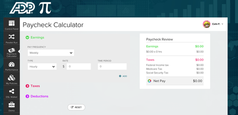
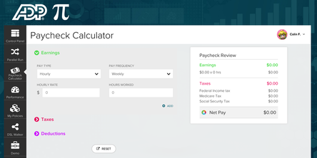
Overall, users saw value in, and were able to use the Paycheck Calculator with relative ease. They understood and saw the dynamic calculation on the right hand side of the screen, and for those who had used a competitor's product saw this as a differentiator and described it as "cool" and "up to date". Only one user said they "expected to have an enter button". Users expressed being pleased with and that the "visual design" matched their expectations of this kind of interface (financial). Several users called out the "green, red, purple" as being appropriate.
Some users expected to hear about or be directed to the Paycheck Calculator by their HR department as part of new hire process. others assumed it would be "Googleable" and be a free tool or perhaps an application.
Some users expected to hear about or be directed to the Paycheck Calculator by their HR department as part of new hire process. others assumed it would be "Googleable" and be a free tool or perhaps an application.
Concept A
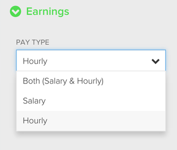
"Shared Input"
|
Concept B "2 Inputs"
|
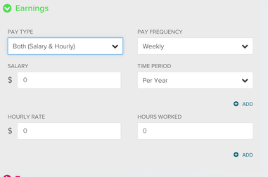
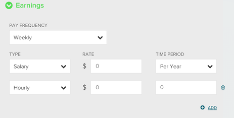
Preferences for either of the concepts were largely driven by the scenario the user was given by the researcher. As an example when asked to account for "overtime" hours in addition to their salary users stated a preference for Concept B (the 2 inputs) since" Both Hourly/Salary" is listed in the dropdown, and the 2nd input box is added automatically, versus them having to hit the "Add" button.
|

|
|
Users presented with:
Scenario 2
Congratulations, you have landed your dream job! You will be moving to Texas and be receiving a 50% increase in your salary. You want to see how your change in location and salary will impact your take home pay.
Stated a preference for Concept A. They did not have to account for a 2nd source of pay/income.
|
On Concept A "Shared Input", when hourly appears below salary, the input field is not labeled. Some users did express confusion about what was being asked for here (number of hours) Consideration should be given to labeling of field.
|
Taxes
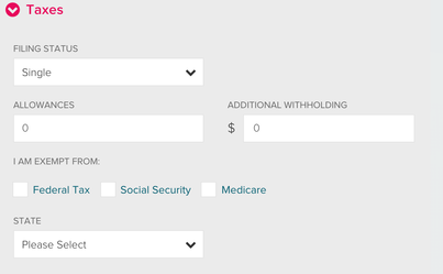
Users easily understood and interacted with the Taxes area and its data input design.
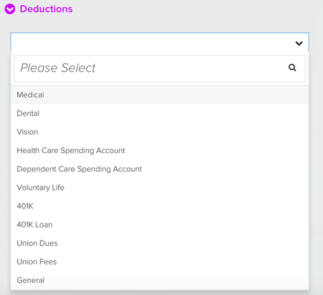
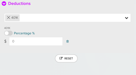
Deductions
Users clearly understood that 401K, insurance items, union dues etc. could be found and accounted for under Deductions. They were able to interact with and select items from the list. However as a limitation of the prototype they struggled with "closing" the list. Though users could not verbalize this, consideration of the interaction design scheme for "search" should be revisited. See visuals below.
Consideration of interaction design here should be revisited.
|
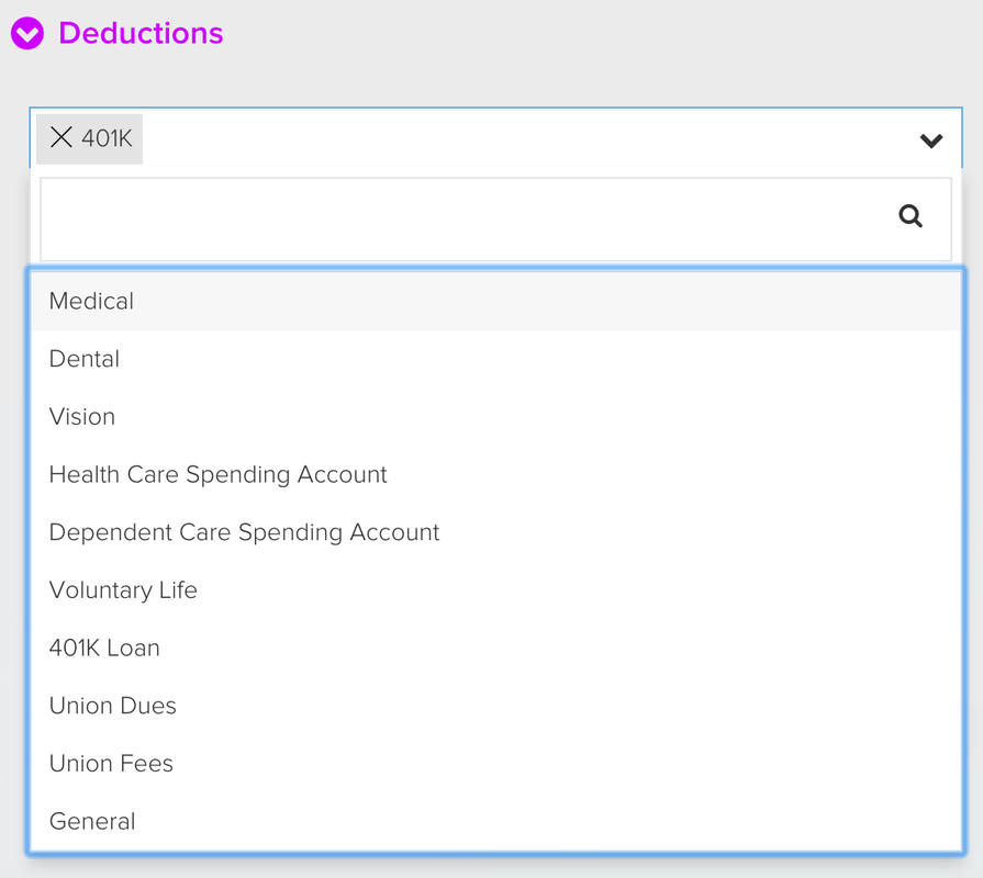
Users did struggle to "close" once they made a selection
|
401K Toggle
There was some minor confusion for users on the toggle
|
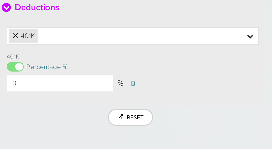
Consideration could be given to the use of "Contextual" help or tool tips with this interaction.
|
